I know you've probably tried everything... natural light, a light box, no light box, camera on a tripod, camera on the floor, hanging upside down from your ceiling fan, taking a running leap INTO the shot... but think about this instead: CONTEXT. Good product pictures are about CONTEXT. Don't believe me? Pick up any magazine anywhere and flip through it. Do you read the articles? Probably not. You get a vibe from the style of photography the magazine employs, and you probably read the captions because it's all you need to know the whole story. (Scholarly journals aside, of course.) The following is a partial excerpt from my book: How to Make It Small When You're Trying to Make it Big.
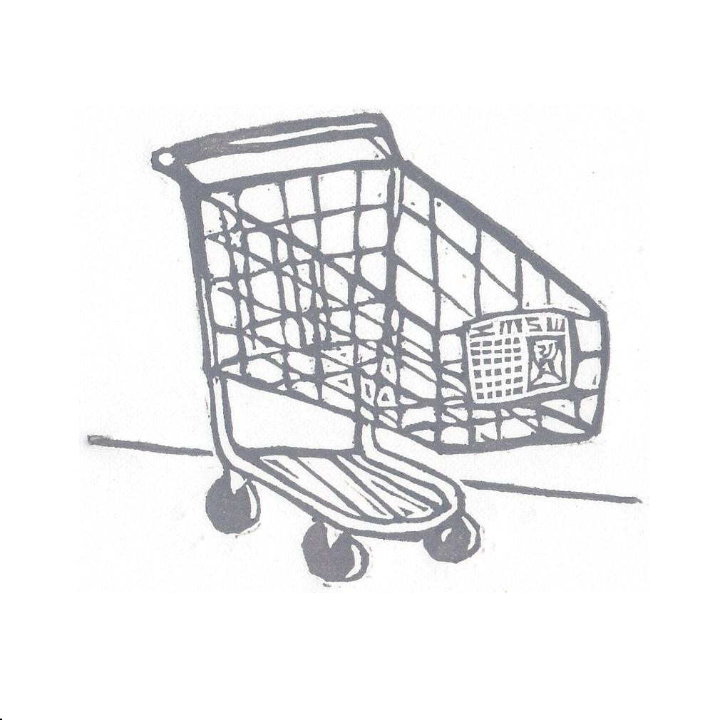
I see people do something all the time that drives me absolutely batty, and it dawned on me the other day that the same thing happens on Etsy all the time. Know what that pet peeve is? It’s grocery carts. (Just hang with me here.) Ever go to the grocery store, buy your groceries, push them out to your car, load them in the trunk, and then turn around and look for the cart return? So far, so good, right? Now, how many times is the grocery cart return equidistant from the store and your car, and yet you take the cart to the return instead of back to the store? Subtract ten points if you’re taking it to a return that is farther away from the store than you actually parked. That makes no sense. Why are you walking fifteen paces to put the cart in a return when you could walk fifteen paces or less and put it back in the store where it ultimately needs to end up anyway? And no, you cannot use the, “It’s good exercise,” excuse.
How does this apply to Etsy or to you? I shall explain...
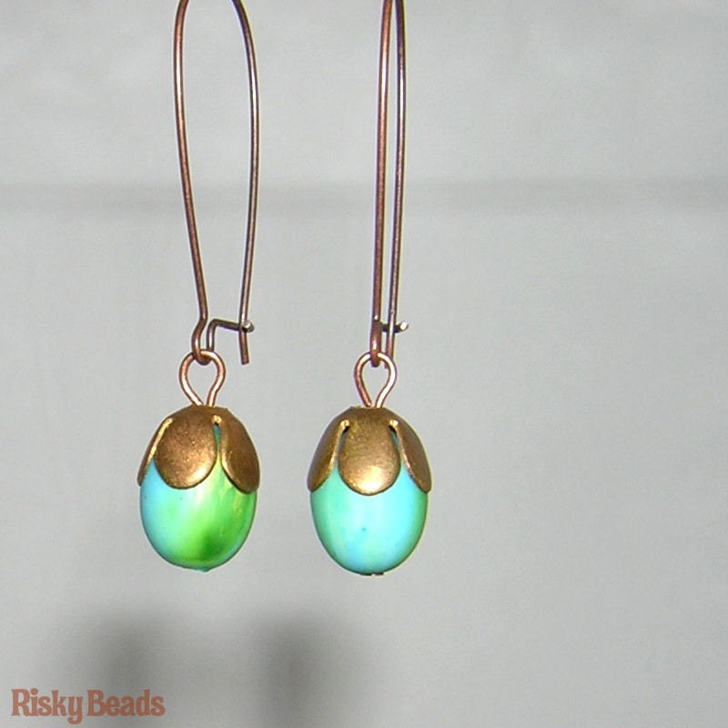
When I first opened Risky Beads, I put up my homemade banner and avatar, listed all of my jewelry and had a few sales, more than I should’ve quite frankly when I go back and look at my pictures. They were horrible. I have a few pieces that are either repeated or reprised, so let’s look at a few before and after shots. We'll focus on earrings because some of my designs seem to live longer than vampires.
Thunder Clap in the beginning:
Thunder Clap Summer 2010:
Thunder Clap Now:
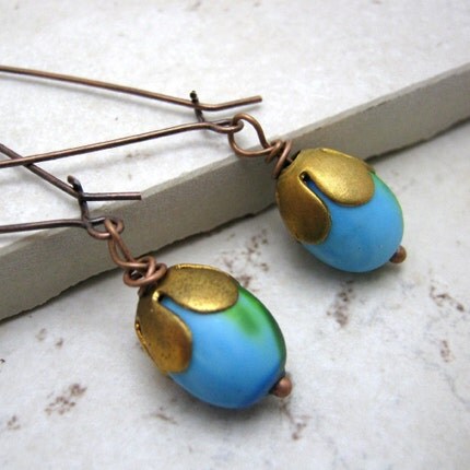
Aqua Acorns in the beginning:
Aqua Acorns thru Spring 2010:
Aqua Acorns now:
And just in case you don't really think those make my point, go back and look at my OLD sold items and you'll get a very depressing vibe that will heretofore make my point. Seriously, go look. I'll wait. It's important.
Now, I just voluntarily embarrassed myself for your education, so please believe me when I say that improving your pictures makes a huge difference. My picture taking process has now gone through several revisions because photography is NOT my cup of tea. It took me a LONG time to get comfortable playing around with my camera, learning the macro setting, and convincing myself that while a straight on, top down picture of a bracelet might be the best representation of the piece it WON'T SELL THE PIECE. And if it doesn't sell the piece, what the hell is the point of photographing it in the first place?
So now you’re probably wondering what in the world this has to do with grocery carts. Well, not focusing on stellar product pictures is like putting your grocery cart in the return that’s equidistant or farther away from the store. Granted, you can put your cart wherever you want, and you can run a shop on Etsy with less than impressive product pictures but don’t both actions defeat the purpose? Your product photo is typically the first interaction you have with your customer. If they like it, they’ll stick around and keep reading even if they don’t like what you’re selling, and this is really important. If you look at your pictures and don’t feel ecstatic about them, then go back to the drawing board and try again. Sometimes I get a really good shot of a piece and end up loving the picture more than the piece! It CAN happen. My Taco Salad bracelet is a good example of that:
There are many ways to take great photos, including using really interesting props, using nature and the outdoors as backdrops, using colored backdrops, etc. If you aren’t sure what suits your product best, browse Etsy and look at the photos that catch your eye and decide what you like about them. Go into the forums and search the forum titles for ‘good pictures’ or ‘taking pictures’ or ‘help with pictures’ and you’ll get a ton of threads filled with experiences Etsyians and photographers offering advice on everything from lighting to cameras to props to cropping. Don't be afraid to experiment with different angles. Get eye level with your product. Zoom in...zoom out...crop it in an interesting way.
Your product pictures should reflect the entire design concept of your shop. For example, if you have a very minimalist concept, banner, and avatar, then don’t have busy photos that are crowded with color. On the other hand, if you have a colorful ‘busy’ shop and want to have pictures that reflect that, then that’s fine. Just be sure that people can distinguish your product in the picture. It can be hard to browse for earrings when they’re hanging off of a toucan in a rainforest. Crisp and relevant product pictures are essential for your shop, and I don’t write this assuming that mine are perfect because I’m always trying to improve them. Always. And here are some quick tips about product pictures:
• Do not post pictures with your camera’s date on them. That looks unprofessional.
• If you choose to put a watermark on your photos, know that Etsy admin tend to not choose those pictures for the front page.
• Watch your backgrounds. Customers want to feel like they’re in a store when they’re shopping, not your extra bedroom.
• Don’t post blurry or dark pictures. People need to see what they’re buying.
• Don’t have extraneous items in your photo that are not related to what you’re selling like your husband’s foot.
• Pay attention to dimensions. Etsy resizes photos to about 1000 pixels square. If you’re picture is smaller than that, there’s a good chance the picture Etsy produces is going to look out of focus. You need to upload a picture that will look right in thumbnail and full view on Etsy or any site you’re selling on.
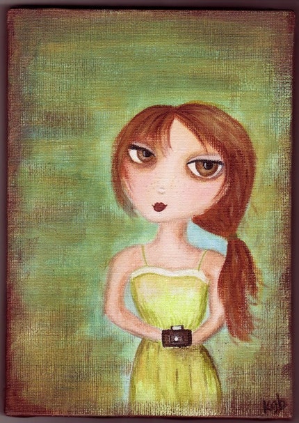
And a couple more points, and then I'll shut up. Don't be afraid of your camera! Look at the picture of 'Claire' above... She's not a professional photographer; she's just a girl with a camera who looks like she takes really interesting pictures. I'm actually interested in what's in her camera just from her face. THIS is how you have to hook people (aka customers.) Make your browsing potential customer unable to look away from your product photo. Make it intoxicating. Set the mood. Buy it dinner. Whatever works. So many people are just surfing through Etsy waiting to be inspired. Stop them in their tracks! After all, people are seducing YOU all day long; that's why you wandered in here instead of say, cooking dinner. Something caught your eye, didn't it? Now it's your turn to pay it forward.
~Lori


Nice picture. I like thunder clap. They are pretty earrings.
ReplyDeleteDiamond Virginia